Sunday, October 11, 2009

My first 3D character design


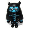
This is the fruit of my Research & Development (R&D) since started to do some character design of my own.

My series are composed of one 15" size and the little ones as 3" size made of resin. They are all unique due to hand-painted. In other words, they are all different.

The figures are not 100% great, but I believe this will be a good start for my future development and success.

Wednesday, August 19, 2009

100% Designed in Macau – Product Design 2

Outdoor of the exhibition hall

My corner and space

My name at the first of the list

Different angle no. 1

Different angle no. 2

CD package close up

I was invited to join a group exhibition 100% Designed in Macau – Product Design 2 at Albergue Santa Casa da Misericórdia de Macau from 29th July till 23rd August. Since this was an unexpected invitation and because I don't have much works in the field of product design, I have to rush to do something at least not in 2D for the exhibition.

For that purpose and for time consuming, I used the characters design that I displayed from my last solo exhibition and force some of my characters to make a migration from paper/canvas to CD package and to t-shirts.

The above images are more or less about my space, my corner and my display at the exhibition.

Monday, August 10, 2009

Postcards contest


I am doing a collaboration contest with www.ilikecharacters.com

Win a pack of 10 postcards designed by me! These were created for my first solo exhibition in my home town Macao.

Visit the site and the postcards are waiting for your collection.

Thursday, June 25, 2009

Cubinho


I can say that this is probably the first character that I designed after I won the Trexi design competition organised by Coca-Cola and Play Imaginative from Singapore two years ago.

Wednesday, June 17, 2009

Clips Creations


Recently I am doing some clean ups and backing up my hard drive and found out these long lost creations that I made last year.

They were "born" from my boredom and the material used are mainly clips and little bit of everyday office stationaries.

Thursday, May 7, 2009

My exhibition at I Like Characters.com


Its great to be featured at the iLikeCharacters.com and regarding to the site of it's owner Steve Rack, it is "A popular blog devoted to the world of character art, which can receive anything up to 1000 unique hits on a daily basis."

"Ilikecharacters.com is 100% dedicated to exploring the weird and wonderful world of character art. Character art can be found everywhere: gallery walls, toy shelves, and even the streets." - Steve Rack.

I am taking this opportunity to thanks Steve for the effort, time and patience that he has faced for the last few days.

Tuesday, May 5, 2009

Photos of the exhibition

Façade of my exhibition

Inside of the exhibition (1)

Inside of the exhibition (2)

Pamphlet of the exhibition

Publicity material (above and below)

A3 poster

Example of my character designs


Standing characters in the window display

Above are some of my selected pictures of my exhibition, still have many more to show, if you want to see, please contact me.

Monday, May 4, 2009

Doodling Box no. 1


Doodling Box no. 1

I cannot remember how long I didn't sit down quietly to draw something already lu. This box took me 4 days to complete (of course not 96hrs straight away) during the long weekend and holidays of Golden Weekend (30-April > 05-May, 2009).

Suppose to hand draw a box for charity where people can put donation for a charity association, but then the more I draw, the more I wanted to do something different and to draw whatever flies in my mind. And finally I forgot about the charity box and made my own art.

Maybe this is called a self-expression.

Enjoy my doodle!

Thursday, April 23, 2009

Proudest school work (final year)

Think before you ...

A series of poster that I designed for student poster design competition while I was still studying at Kent Institute of Art and Design (KIAD).

This is one of the proudest school work that I have done and now looking it back, my works are already very illustrative and not relying in photos and special effects. Maybe one of the reason is because my computer was not powerful enough at that time.

I may say that the posters were a try out of making in a series. I remembered at the begining I only design the first one, and then the tutor asked me to develop more to make a series and still being the same style under my signature.

At end I designed a poster in a series of 3, kept the house as main image and the title strong and bold.

Wednesday, April 22, 2009

Love Your Earth 2007

Proof Read b4 Brint!

Found this poster design competition online with the theme of raising awareness of the environmental issues organised by designboom.

My design reflects to my everyday work which is designing, printing, proof reading and then printing again. This continuous non-stop and repetitive process keeps going and I am very regretted about the waste and wanted to bring my respect to the nature, forest and paper industry.

If you want to see other winners, please visit to the website of designboom. It's worth a visit!

2007 Macao Annual Art Exhibition


Type-Face-Recipe

A series of poster that was included in the list of 10 best entries for 2007 Macao Annual Art Exhibition.

I am confidence that I could win or be selected for the group exhibition, but didn't expect to be 10 best entries of the exhibition.

These series show the everyday use of typeface can have a lot of possibilities to transform into different kind of icons with full of expressions.

Poster design contest for CCAC in 2002

Poster design for CCAC in 2002

Long time ago, I applied for a poster design competition for CCAC in 2002 while I was still in UK.

Because I like to use types as main image during that time and being influenced by European typographic design, I put a big Chinese character 完 (end in English) together with a meaningful slogan saying that "Corruption, end of everything!".

This design let me feel the taste of sucess in poster design because I received an Honourable Mention.

Tuesday, April 21, 2009

Good 50 x 70 2007

Poster for Good 50 x 70 2007 submission

In 2007 I submitted a poster with the theme of WAR for the yearly poster design event Good 50 x 70. The name of the event came from the size of a standard poster which is 50x70cm.

This event aims for wakening the creative community that we are still facing a lot of social problems and we should start doing something to provent those problems.

It has a variety of themes under the project: AIDS, Environmental Damage, Human Rights Violation, Underdevelopment, War, etc.

My poster is designed in a cartoonist style to make it acceptable to general public and easy to understand. The title is "Crush all the weeds", if we don't crush, WAR, fighting, violence, blood, weapon will continue to be expanded.

Monday, April 20, 2009

First International Award! 2003

First International Award for a stamp design.

First international award in 2003 in which I have to design a postage stamp for Ministry of Public Management, Home Affairs, Post and Telecommunications, Japan.

I received an Honourable Mention by post and I couldn't believe that I won an award in Japan! That's very important to me and meaningful, because this means that I am getting closer to an international level.

The brief was asked to design a stamp with a theme to remember Hiroshima Memorial Hall (the Atomic Bomb Dome). This is one of my experimental works to make one line drawing without breaking it. There you can see a Human which is represented with line drawing protecting the world and then a bomb flying to the direction of Japan.

Wedding card design to my cousin in 2003

Wedding card design

A wedding gift to my cousin when she got married in 2003. This was really a tremendous experience when I was in UK, because they were in Macau and it was very difficult to explain to them directly what I want and how to show them, because in my point of view, touching and feeling the weight and texture of the card is very important, now thinking it back, my cousin really took some risks at choosing my design.

The idea of the design was playing with typography, as that time I was in love to design things with types. Inside the image of the heart, there is the name of the couple.

Wedding card to my friend

Wedding card design

A wedding gift to my best friend back to 2003. I used the fingerprints as its main concept and the cover of the card was hand mounted to make a feel of artistic touch. Not many people realize that the fingerprints have the names of the couple on it, means they cannot escape of this marriage. haha

Thank You poster in 2003/04

Thank you! From Ou Mun.

One of the top 10 entries poster design competition organised by Cultural Affairs Bureau welcoming the visit of international well-known Japanese graphic designer Mr. Shigeo Fukuda to Macau. His style is about playing with optical illusion, with that in mind, I also did a try on this style by making a Thank You poster to his visit. Two silhouettes of Ruins of St. Paul’s pointing each other and made the initial of “M” which means Macau.

Trexi design 2007

Lampada-Man for Trexi "A Better Tomorrow"

Coca-Cola and Play Imaginative organised an international toy design competition in 2007 to design a new series of Trexi "A Better Tomorrow".

Being a super fan of the brand and child mind adult, this is a good opportunity for me to have some fun. For that reason, I decided to have a try at doing something not my strong discipline. Drawing and illustration is not really my cup of tea, but because this is for Coca-Cola and for toys, I cannot resist to this temptation.

My design was selected to be produced because was rated as top 15 to produce into real toy together with 10 other well-known designers and this was my first time to receive an award not based in paper but in a 3D object.

My trexi is called Lampada-Man, because I want to incorporate some Portuguese influence in it so I matched the word Lampada which means a lightbulb with Man, just to make it sounds like a superhero from American comics.

The new toy which is out to the market for a while already is a bit of my reflection and here it is the brief introduction of my design: "Lâmpada-Man is a fan of Coca-Cola which born to believe knowledge, ideas, creativity, innovation & eager to break boundaries can bring a better tomorrow. Even though he is smart & clever, he is also very shy and always afraid what he creates will not be accepted by general public."

MGTO What's On

Heading of "What's On"


MGTO "What's On" Nº70, 4/2009

My exhibition was also published at the monthly newsletter of Macau Government Tourist Office "What's On" both in English and Chinese edition.

Day of Portugal, Camões and Portuguese Language Community 2007

Poster design, June 2007

As I am a Portuguese born and living in Macau, I cannot find an excuse not to apply for this poster design competition held two years ago in 2007 by Instituto Português do Oriente.

For this purpose, I designed a poster for myself and for the Portuguese community to join together. What I wanted to do is that I design the basic image of the poster and the rest let the Portuguese community to fill in phrases about being Portuguese, what they think on the day, how great was the people of discoveries, etc. Everything about and related to Portugal.

The end result of the poster cannot predict, because everyone that I asked for help have different thoughts about what to write and what to say.

Finally the outcome of the poster is in this post and if you are interested to see the winning poster, you can visit the site of IPOR.

News at Tribuna Macau

10th March 2009

I had a tele-interview by Raquel Carvalho from Tribuna Macau to talk about my first solo exhibition.

Saturday, April 18, 2009

Poster design with the theme of TRADITION


Don't Panic Poster - TRADITION


This is for a monthly poster design competition organised by Don't Panic. Each month will select one winner for the publication. You can take a look at the above link if you are interested.

I applied once in March 2008 and the result was quite good, my poster was nearly be chosen for the publication. But unfortunately.......

Here's the concept behind my poster. "The tradition of head-to-head conversation is outdated. The common way of conversation @ this era is head-to-monitor in which the monitor is represented in a square head at far end corner of the poster, while the rest is illustrated with a variety of hairstyles that means different people from different background, customs, culture, traditions, habits, style, etc, all queuing to talk with the square box."

LinkWithin

Related Posts with Thumbnails