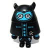
.jpg) I used the colour that I like most for the logo of the exhibition, blue (C100 + M36), because this is mysterious and intellectual.
I used the colour that I like most for the logo of the exhibition, blue (C100 + M36), because this is mysterious and intellectual.The silhouette of a character is my self-portrait and is only released or uncovered on the day of opening to make it unknown.
The word unknown in the logo was written in a different way, i used the uncommon way of reading the word using the International Phonetic Alphabet (IPA) that we used normally in the dictionary. When we look for a word, don't you see some strange words or alphabets that teach the way the word is pronounce? That's a phonetic alphabet based on latin alphabet.
By doing that, I showed already how uncommon this exhibition is going to be and this can be what so called Unknown.


No comments:
Post a Comment